Image Processing Image Element
The BASE project base uses within page editing the structural element "Image" offering a variety of options regarding definition of image size, linking, mouseover, image section, etc. The the following, we provide details on this Image element wird nachfolgend eingegangen.

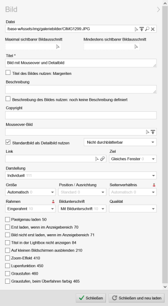
Image processing - Weblic image element

View of the Weblic image element in processing
Operation
The maintenance fields for the image element described in the following may vary depending on Project configuration.
'File':
In this field you select the image file you want to link up through the right selection arrowOne a path has been entered in the field, a magnifier symbol
Through the waste paper bin symbol
Through the upload symbol
'Selection box "Adjust size", etc.':
Through this selection box you determine the size of the previously selected image. You may choose between the following options:- Adjust size
- Original size
- Free size scaling
This selection will only appear if the setting "Any image size definable" has been activated in the project configuration. - Medium 50%
- Small 33%
'Selection box "Alignment"':
Through this selection box you determine the alignment of the previously selected image. You may choose between the following options:- No alignment
- Align left
- Align right
'Image section':
By clicking the selection arrowYou can delete a defined image section by clicking the wastepaper bin symbol
'Image quality':
Through this selection box you determine the quality of the image to be generated in per cent. As standard the default value chosen in the project configuration (e.g. standard: 80%) is preselected if no other value has been selected.This selection box is only displayed if the selected picture is a JPG picture and if the setting "Quality adjustable per image" has been activated.
'Title / Alternative text':
In this field you enter the alternative text for the selected image that is meant to describe the image in more detail. With many browsers, the alternative text becomes visible by mouseover and is particularly important for barrier-free websites.By default, this field is a compulsory field that can be individually deactivated in the project configuration under "Alternative text is a compulsory field" (not recommended).
Provided that the setting "Title and alternative text subject to separate maintenance" has been activated, separate maintenance fields will be displayed for both values.
'Always automatically determine the title from the file attributes':
If this parameter is activated, the title of the linked image file as taken out of the document extension. Therefore it is recommended to activate this function only for checked-in image files for which the title has been entered. Otherwise the title cannot be determined, resulting in a previously manually filled in title field being emptied after saving.'Copyright text':
Optionally, you may enter a text in this field that is added as a watermark in the bottom right corner (e.g. © Mustermann AG).This field will only be displayed, if the fragment with the id="copyrightText" has been set manually for the current image element.
Please note: This function is available in the beta state!
'Mouseover image':
In this field you select optionally through the right selection arrowOne a path has been entered in the field, a magnifier symbol
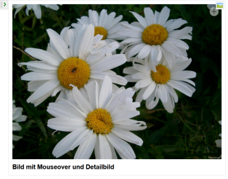
The linked image will appear through mouseover instead of the original image.
'Detail image on clicking':
In this field you select optionally through the right selection arrowThe linked image will appear in a fancybox when clicking on the original image, with the original image marked with a + symbol.
'Use standard image also as detail image':
If this parameter is activated, it is not necessary to fill in the above mentioned field for the dtail image. An image included in the page, the size of which has been adjusted to the appropriate width for the column, will be automatically set as detail image together with the original image it is based on.'Browsing not possible':
Through this selection box you determine whether browsing is possible between several detail images within the same fancybox. ("Browsing possible") or not ("Browsing not possible").'Image width detail picture in pixels':
In this field, you may optionally enter the width of the detail image in pixels (e.g. 150). The image opened in a fancybox will be scaled down to the entered width.This field will only appear if the setting "Detail image width freely definable" has been activated in the project configuration.
'Link':
In this field you select optionally through the right selection arrowOnce a path has been entered in the field, a magnifier symbol
This field will only appear if the setting "Image can be linked" has been activated in the project configuration.
'Selection box "Target", etc.':
Through this selection box you choose the target for the linked file where the file should be opened. You may choose between the following options:- Same window
- New window
- In a fancybox
This field will only appear if the setting "Image can be linked" has been activated in the project configuration.
'Image Map ID':
In this field you may optionally enter the ID for an Image Map that can be included in the page via HTML source text element (see for example SELFHTML: HTML/XHTML / graphics / reference-sensitive graphics (Image Maps).This field will only appear if the setting "Image Map can be linked" has been activated in the project configuration.
'Show caption':
If this parameter is activated, the text of the above mentioned title field is set as caption.This field will only appear if the setting "Caption (Title) can be shown" has been activated in the project configuration.
'Frame image':
If this parameter is activated, the generated image will be framed.This field will only appear if the setting "Frame" has been activated in the project configuration.
'Selection box "Classes"':
Through this selection box you choose the class defining the representation of the image on the website. These classes are determined by the admin and defined as formatting via the centralised CSS file.This field will only appear if the setting "Style classes selectable" has been activated in the project configuration.
'Generate a HD version of the image':
If this parameter is activated, the selected image ins generated in HD quality if a terminal capable of HD (e.g. iPad mit Retina® Display)calls the page. Depending on the settings in the project configuration this parameter can also be activated by default and thus cannot be deactivated by the editor (representation greyed out).This field will only appear if the setting "Generate HD images" has been activated in the project configuration.
'Load images only when in display range':
If this parameter is activated, Lazy Loading is activated for the image - that means: You can determine that images are only loaded when in the visible area of the screen. Effect: faster page loading.This field will only appear if the setting "Enable Lazy Loading" has been activated in the project configuration.
'Offer Pinterest Pin It Button':
If this parameter is activated, a Pinterest Pin It Button is displayed for the image (see also Pinterest Homepage).This field will only appear if the setting "Pinterest Pin It Button" has been activated in the project configuration.


