Components - Combining individual elements
Components are used in Weblication® CMS for simple and fast page design of several individual structural elements and are based on the functionality of the Structure Editor module. This allows administrators and web agencies to create such components with a simple mouse click.
More complex page content, e.g. with interdependent structural elements, can be made available to editors in this way via a component.
Components can be used at the top level of a content area (e.g. top area (content 3) or content area (content1)) if they are already enclosed as a component with a content area element.
Examples of the use of components:
- Image-text areas
e.g. left/right aligned images with text outflow - Containers with nested content
e.g. tables, texts, etc. - Applications with related elements
e.g. event calendar elements, glossary, etc. - etc.
Components are automatically offered for insertion in a mini preview in the structure editor under the menu item"Insertable components". These components, which usually consist of several individual elements, can be integrated into any page at the click of a mouse.


Video about components:
Operation
A component is created and inserted using the functions of the Structure Editor add-on module.
'Create insertable component':
To create an insertable component, go to the structure element in page editing that contains the summary of the elements that are to form a component. If this does not yet exist, first insert a container element (e.g. content area) and fill this with the desired elements.
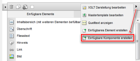
Now click on the selection arrow of the structure editor symbol for the relevant structure element.
In the open layer, move the mouse over the arrow symbol in the top bar on the far right and select"Create insertable component" in the layer that opens.
The component has now been created and is available for selection in the structure editor as a further column"Insertable components" in addition to the"Insertable elements" column.
'Edit insertable components':
To edit an insertable component, either call up the Weblics administration and can edit the existing components there in the "Insertable components" tab. Alternatively, you can call up the directory of insertable components via any structural element and selecting the components there. This is done by clicking on the folder symbol that appears on the right-hand side when you move over the "Insertable components" tab (see also below).
'Select insertable component / Insert component':
To use an insertable component in a page, insert it at the desired position by selecting it using the structure editor. If a component itself has a content area element as its outermost element, it can only be inserted at the top level of a content area (conten1, content2, etc).
Click on the"Insertable components" tab either via the"Add element (to main area)" button or via an existing structure element. The tab lists the available components in a thumbnail preview and (if set) a descriptive title. By clicking on a component, it is inserted into the page as a structural element at the current position.
If no insertable component exists yet, the "Insertablecomponents" tab does not appear.
Components should be grouped together in a container. This is preferably a content area or, for example, a content box or a multi-column content container. If the relevant element does not correspond to a 'container' type when creating a component in the editor, the software automatically sets a content area container as the top element of the component.


